Tampilkan postingan dengan label Art. Tampilkan semua postingan

Kamis, 25 April 2013

The Tattooed Poets Project: Ethan Hon

Next up in the Tattooed Poets Project is Ethan Hon.

I met up with Ethan in the Carroll Gardens section of Brooklyn earlier this month and took photos of three of his tattoos.

Ethan credits the talented artists at Fineline Tattoo in Manhattan.


Ethan explained that "the tattoos of Keats [above] and f(x) [below] were done by Mehai Bakaty." He added, "Keats is self-explanatory [and] F(x) I got done as reminder to be a person, to function."


As for the third tattoo (directly below), Ethan explained,
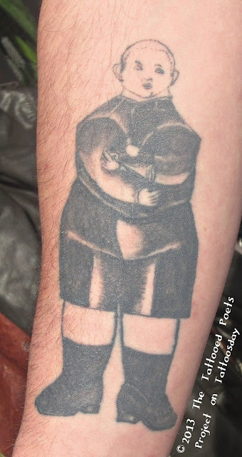
"Mike Bakaty tattooed Boy with Machine by Richard Lindner [and] was done because I couldn't stop looking at it and also because as Deleuze and Guattari remind us: A schizophrenic out for a walk is a better model than a neurotic lying on the analyst's couch. A breath of fresh air, a relationship with the outside world.
I have two other tattoos not pictured: Cascading black hearts and [one] of Ulysses with his dog once he has returned, along with the Arnold Geulincx phrase, 'Ubi nihil vales, ibi nihil velis' translated roughly as 'Where you are worth nothing, then you shall want for nothing' beneath it.
Ethan sent us this poem:

Red Hook

Jesus has dicks for hands
we must not tell him. Of course,
we will never tell him. Again,
or rather once, Dan walked, drenched
from New Jersey, home to New Jersey.
Last night I lay on the floor with a dog
named Pirate. Don’t tell Creezy.
When Santo told me his tattoo
was of his brother, I told him he should
never wear sleeves. It was not but
it was warm. I should only think
of things that are dripping with fuck--
across her lips, I did not negotiate a life
preserver. The world opens to my de-claring.
To have once been enamored is nice
but now I think everyone is divorcing,
Sail by me on your bicycles,
saying, “See you next Tuesday.”

~ ~ ~

Ethan J. Hon is from Omaha, Nebraska. He is a co-founder of JERRY MAGAZINE. His poems and prose have appeared or are forthcoming in Screen and Paper, TheThe, The New Inquiry, Dossier, Tin House, Cimarron Review, Cannibal, Nebraska Review, and Assembly Magazine. His paper “It Is Easier to Raise a Shrine than Bring the Deity Down to Haunt It: Beckett in the Blogosphere” was presented in June of 2011 at Samuel Beckett: Out of the Archive International Conference. He lives in Brooklyn, NY.

Thanks to Ethan for contributing to the Tattooed Poets Project on Tattoosday!

This entry is ©2013 Tattoosday. The poem and tattoos are reprinted with the poet's permission.

If you are reading this on another web site other than Tattoosday, without attribution, please note that it has been copied without the author's permission and is in violation of copyright laws. Please feel free to visit http://tattoosday.blogspot.com and read our original content. Please let me know if you saw this elsewhere so I contact the webmaster of the offending site and advise them of this violation in their Terms of Use Agreement.

Selasa, 23 April 2013

The Tattooed Poets Project: Kevin Patrick Lee

Our next tattooed poet is Kevin Patrick Lee, who had initially expressed an interest last year in our project, but we had to wait for 2013 to run his submission.

We're running this post on a Tat-Tuesday, because, as Kevin explains, he sent us "two poems ... regarding the subject matter of each [tattoo]." And because, "each poem gives insight into the respective tattoo," he adds, "...further explanation isn't needed."

First, the tattoos, side by side on Kevin's inner forearms:


We'll start with the tattoo on  the left (Kevin's right), which is a portrait of his father. Followers of the television series L.A. Ink might remember this piece, which was featured on the show and created by Corey Miller at High Voltage Tattoo in West Hollywood.

This is the accompanying poem:


The Reality

My father died in my arms
early on a Thursday morning.

I wasn’t scared, I wasn’t even sad.
there was no time or room for that;
that was my mother’s job.

At the time, my brother and I
worked in the same warehouse,
the same dirt, the same grime,
the same bullshit from corporate pricks.

The day after my dad died,
my brother was back at work,
and I made it in the day after that.
We probably worked harder those few days,
than we ever had before.

And we got a lot of awkward looks,
uncertain stares that said,
“Hey, what are you doing here?
You should be at home, wilting and weeping.”

But like our hard-working Irish father,
we are blue-collared through and through,
until one day we too kick the bucket
butt naked on the cold linoleum
of the bathroom floor
some unsuspecting morning.

And though we have a lifetime to mourn,
the truth is,
bills don’t stop for death
and rent is always due on the 1st.

===========================================================

The tattoo on the right (Kevin's left) is based on Frida Kahlo's painting "The Broken Column" and was tattooed by Brittan "London" Reese at Vatican Studios in Lake Forest, California. The poem accompanying this tattoo is "Hooked":


Hooked


When I walked out of our apartment for the last time,
I grabbed every roll of toilet paper.
I took the clips that tacked down the cable wire.
I picked up all the damn bobby pins that miraculously
flew out of my wife’s hair and onto the carpet.

I stripped everything, except 2 hooks on the wall.
The two hooks that held up a painting that brought my wife and I together;
It was Frida Kahlo’s Broken Column.
There is nothing romantic or sexy about the painting,
except perhaps Frida’s bare breasts,
which I’m sure weren’t as perfect as
Salma Hayek’s breasts which played the part of Frida’s breasts
in Julie Taymor’s 2002 amazingly colorful film.

I don’t know what my wife’s attraction to the painting was,
and I still don’t,
but I identified with the nails scattered all over her body
and the literal broken column of her spine.

There were times in my mid-twenties where I couldn’t
roll over in bed to turn off my alarm clock because the discs
in my back were angry over their current living situation.
My doctor asking me, “So when do you want to schedule surgery.”
I never took her up on her offer,
instead popping pain pills and muscle relaxants when needed.
Luckily I have never been the addict.

And I have nothing to complain about,
as so many people have it worse.
I know a woman who had something
implanted in her that would permanently
block the pain receptors going to her back,
because without it, she would have hung herself.

This was our favorite painting separately before we met,
and perhaps it just goes to show that sometimes
pain and suffering leads to extraordinary things.

I left the apartment and those two hooks,
and wanted to beg the landlord to keep them there,
so that perhaps it would bring inspiration to two more people
to hang something on the wall together,
the walls that hold them together,
the walls that keep them safe together,
so that they could fall in love here,
make a family here,
so that they could one day move on
and beg the landlord to leave the hooks in the wall.

===========================================================

Kevin Patrick Lee is the husband of a beautiful blue-eyed woman, and the father of a cool blue-eyed boy. He hosts a monthly poetry series called The Hump Readings, was a founder of Beside the City of Angels: a Long Beach Poetry Festival, and runs Aortic Books. His work has appeared in book collections and many great small press mags. A book is forthcoming in 2013 by World Parade Books.

Thanks to Kevin for sharing his poetry and tattoos with us here on the Tattooed Poets Project on Tattoosday!

This entry is ©2013 Tattoosday. The poems and tattoos are reprinted with the poet's permission.

If you are reading this on another web site other than Tattoosday, without attribution, please note that it has been copied without the author's permission and is in violation of copyright laws. Please feel free to visit http://tattoosday.blogspot.com and read our original content. Please let me know if you saw this elsewhere so I contact the webmaster of the offending site and advise them of this violation in their Terms of Use Agreement.


Jumat, 18 Januari 2013

John's Incredible Art-Themed Sleeve by Stefano Alcantara

If you go back to the beginnings of Tattoosday, one of our earliest contributors was John Sorezza, a friend of the neighborhood who I see quite often. He shared his first work, the beginning of a leg piece, here.

In the years that have passed since I first met him, John has taken up work as a tattoo artist and tattoos out of Brooklyn Made Tattoo.

Over last summer I ran into him down the block and he shared some of his latest ink, all inspired by his new vocation:


As I've said before, sleeves are always a challenge to capture on a web page, especially when the photos are taken out on the street, where natural light differs, depending on the angle. Despite my amazing photo editing skills, the collage above is marred by totally different tones, but you can still see the gist of the tattoo - the phrase "ART IS PAIN" carved from the inside with an X-Acto knife, with a dripping paintbrush, pen and pencil, all tools of the artist's trade, poking through the letters in the flesh.

And if you weren't impressed by that, check out this phenomenal tattoo machine on the inner part of John's forearm:


And all of this is punctuated by this mask on the back of his hand:


John pointed out that the eyes are fashioned with pen quills, to keep with the theme of this art-inspired sleeve.

This amazing work is the product of the great Stefano Alcantara, who hails from Lima, Peru, and tattoos out of world-famous Paul Booth's Last Rites Tattoo Theater here in New York City. You can also check out Alcantara's Facebook fan page here.

Thanks again to John for continuing to share his work with us here on Tattoosday! You can find John at Brooklyn Made Tattoo in Bay Ridge.

See John's other tattoos here, here, here, and here.

This entry is ©2013 Tattoosday.

If you are seeing this on another website other than Tattoosday, without attribution, please note that it has been copied without the author's permission and is in violation of copyright laws. Please feel free to visit http://tattoosday.blogspot.com and read our original content. Please let me know if you saw this elsewhere so I contact the webmaster of the offending site and advise them of this violation in their Terms of Use Agreement.

Senin, 02 Agustus 2010

On the Beauty of Magazines

I finally got around to picking up a copy of Freja's Vogue UK. My encounter with this particular issue is just going to reiterate how important I think it is to buy actual magazines because the viewing experience is so much more enriching and fulfilling than just seeing the images online. The colors seem more vibrant, the glossiness of the paper adds dimension and having a tangible object in your hands makes the images look better......at least to me. You're also privy to more information about the images you're viewing, making for a more robust experience. Case in point: The editor's letter and contributors pages tell us what people think about Freja, and they tell us about the context and inspiration for her editorial.

I feel like I was destined to love this editorial because it combines two of my (and probably the vast majority of twenty-something females') interests: art and fashion. I know this isn't a novel concept by any means, but I feel like rarely do we get to see the connection and conversation between the two so pronounced as it is in this editorial. Josh Olins took his cue from English figurative painter Euan Uglow. Knowing this tiny, but significant, fact changes things completely. I now look at the editorial with new eyes and the images take on new significance, especially when compared with their inspirational source:


If you read about Uglow and his artistic process, Olin's photographs don't seem so simple in their appearance anymore. My previous thoughts on the editorial read Freja's positions and poses as the best way to display the clothes. But I found this particular bit about Eglow's working methods particularly enlightening:
"Planes are articulated very precisely, edges are sharply defined, and colours are differentiated with great subtlety. His type of realism has its basis in geometry...."


That's from his Wikipedia page. (I have better researching skills but considering my lack of time and library resources, that will have to do.) Freja was posed that way to emulate the figures in Uglow's work. The planes, sharp edges and colors also happen to be great ways to show off new looks for the upcoming season. :) Fashion and art intersect in so many ways that it's a pity the same respect and scholarly seriousness hasn't been accorded to fashion like it has been to art....but that's a whole other story.

In case you want to know, here's what Josh said about Freja on the Contributors Page:
"I'm really glad my first cover is with Freja. She's beautiful but boyish, and has this great repertoire of innocent and feminine expressions. She'll sit down and look grumpy, but when you take the picture she looks captivating."
And here's what Alexandra Schulman said in her Editor's Letter:
"We all admire Freja for her distinctive looks, which stand out amoung the sea of pretty, tawny-haired models that often prevail on the catwalk. Photographer Josh Olins's shoot, featuring autumn's off-beat colour mixes, is the perfect vehicle for her boy/girl allure."
Mentioning Freja and "boyishness" has become too easy and trite that's it's completely lost all meaning for me. I wish people would start to move away from that because it dilutes the meaning of the term, and frankly I think it's a misuse. In her modeling work I really don't see how she's more boyish than any other model. Hilary Rhoda and Isabeli Fontana (no offense to them) have the manliest jaws in the industry but they're both considered "sexy." Maybe the term is in reference to her body, but in editorials where she's wearing clothes to cover that up it becomes a non-issue. Maybe it's in reference to her demeanor in person and on set, and for that I have no factual basis to judge that on. It just don't get it, so please someone enlighten me. Moving on....

This instance just strengthens my resolve to continue buying magazines because the industry cannot die out. If I had not bought this issue I never would have read about the Uglow reference. It would be a travesty to lose the print industry; not just magazines but books as well. Having something in my hands forces me to read it and absorb it more than I would have if it was just on the screen. (The irony of me using a digital method to communicate this message isn't lost on me.) Technology is wonderful and it gives us so many things, but to completely lose the preciousness and uniqueness of certain experiences in the haste towards progress and technological trends would be a huge mistake. It doesn't have to be one or the other. People can have i-Pads and e-readers and still buy magazines and books, with both mediums working in concert to create a complete and total experience. Or maybe I'm just too old-school and living in a dream world....

Image Credits: Scans by tFS member fearless123, artnet.com, marlboroughfineart.com, telegraph.co.uk

Jumat, 18 September 2009

Art and Commerce

I've never been this underwhelmed by Freja's presence in an editorial. Perhaps my expectations were raised too high when I first heard about the ed. How can you go wrong with Inez and Vinoodh shooting Freja and Raquel? The first preview image seemed promising, even though Freja was relegated to the role of masculine, androgynous model once again. Even though it's a hackneyed role for her, Freja still could have been amazing, especially with Raquel playing the counterpoint.

What we get instead is Freja confined in the background, mostly as a prop. She doesn't even change outfits. The two main players in the editorial are clearly Raquel and all the amazing contemporary art. Both deliver so well that I wonder why Inez and Vinoodh even used Freja at all? She's a great model, so I'd rather have them take advantage of her skill then stick her casually in the back because that's just a tease.

Anyway, this editorial is long, but really amazing despite Freja's underwhelming presence. The art history lover in me is thrilled by the artists and pieces included. And Raquel shows how amazing she is once again, and why she's been in the industry for so long. You'd be hard pressed to find someone better than her to emulate and interact with the art the way she does.

Art and Commerce
W Magazine October 2009
Ph: Inez and Vinoodh


Image Credits: My Scans